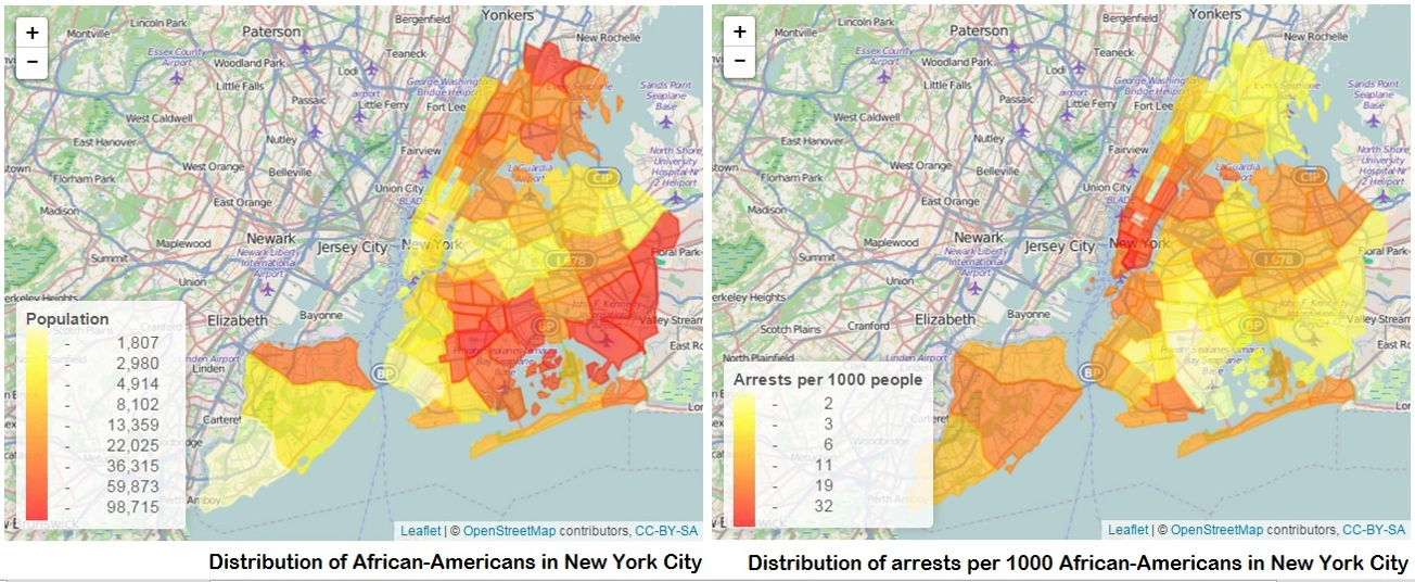
psychic
NYPD
MODULE 1
MODULE 2
MODULE 3
HANDOUTS

NYPD

Exploring Racial Disparities in New York City's Stop-and-Frisk Policies

By Shonda Kuiper. Contributors: Yusen He, Allie Jones, Shreyas Agrawal '24, Bowen Mince '22, Wagih Henawi '22, Adam Solar '22, Ying Long '17, Krit Petrachaianan '17, Zachary Segall '18


Key Idea:key idea icon

Visualizing data through maps can allow us to find meaningful patterns in data.

Part 3A: Introduction

In the 2013 U.S. District Court case, the NYPD defended its stop and frisk practices, saying that since crimes mostly occur in Black and Latino neighborhoods, it is understandable that more Black people would be found suspicious of crimes.

Let’s look at the data to evaluate the NYPD’s claim. If this claim were the only reason for the disparity in stops, we might expect people of color to have a higher likelihood of being stopped in Black and Latino neighborhoods. In Figure 3 below, we can compare the police stops to the racial distribution in each precinct.

data figures

Figure 3A: The distribution of Black people in New York City by precinct. There is a higher population density of Black people (denoted by redder colors) who tend to live in the southeast portion of the city—in Brooklyn, South Queens, and the Bronx.

Figure 3B: The number of arrests per 1000 Black people in New York City by precinct. Arrests of Black people are happening most frequently in Manhattan, Northern Queens, and Staten Island. The number of arrests per 1000 people is low in the southeast regions (where Black population density is higher) and higher in the northwest section of the city.


Part 3B: Explore The Data

Use the app to look at multiple graphics evaluating NYPD stop and frisks based upon year, race, gender, and type of crime.


To make a graph that looks like Figure 3A, select:

  • Year:   2005
  • Color Precincts by:   Racial distribution for each precint: Black
  • Remove Precints:   22
  • Scale:   Logarithmic


  • Instructors Note: Go to faculty resources to access student data


    Part 3D: Get Curiousget curious icon

    1. What would we expect the above graphs to look like if there was a strong relationship between the racial distribution of a precinct and the number of Black people that were arrested?/h4>

    2. Add Precinct 22 back into the dataset, then click on that precinct in the MAP. Notice that Precinct 22 tends to have very different characteristics than most other precincts. As such, it is often removed from the data as an outlier. Zoom into the graph and provide a brief explanation as to why Precinct 22 may be different than other locations.

    3. Precinct 114 is close to the center of the city and tends to have a large number of arrests. Zoom into this location and identify a feature of this precinct that could explain a large number of arrests in this area. (Hint: What is Rikers Island?)

    4. What are some practical ways that citizens, lawmakers, police departments, or other stakeholders could use this data?


    Explore Other Stories


    Data Stories


    NYPD
    Covid-19
    Recidivism
    Brexit

    Stats Games


    Racer
    Greenhouse
    Statistically Grounded
    Psychic

    Questions?


    If you have any questions or comments, please email us at DASIL@grinnell.edu

    Dataspace is supported by the Grinnell College Innovation Fund and was developed by Grinnell College faculty and students. Copyright © 2021. All rights reserved

    This page was last updated on  November 11th  2024.