psychic
NYPD
MODULE 1
MODULE 2
MODULE 3
HANDOUTS

NYPD

Exploring Racial Disparities in New York City's Stop-and-Frisk Policies

By Shonda Kuiper. Contributors: Yusen He, Allie Jones, Shreyas Agrawal '24, Bowen Mince '22, Wagih Henawi '22, Adam Solar '22, Ying Long '17, Krit Petrachaianan '17, Zachary Segall '18


Key Idea:key idea icon

Percentages can be mathematically accurate, but lead to very different conclusions.

Part 1A: Introduction

Ronnie is headed home after a day of school. He’s got a spring in his step as he makes his way through his Brooklyn neighborhood. As he reaches for his keys, he gets a sinking feeling, realizing he left them on the kitchen table. He shuffles past the bushes and cups his hands to look into the first-floor window, checking to see if his younger sister is home yet. As he’s fumbling with the front door, two men come up and gruffly ask him what he’s doing.

They flash their badges and tell him they’re going to search him, based on his suspicious behavior. Tongue-tied, Ronnie tries to explain the situation as one man starts rifling through his backpack, and the other one pats him down. Even though he didn’t do anything wrong, his heart is pounding, and his palms start to sweat.

After several minutes, the cops conclude that Ronnie’s story checks out, and they head down the street, leaving Ronnie to wonder just how much of that interaction had to do with the color of his skin.

The New York City stop-and-frisk policy allowed police to stop and search individuals when any officer had "reasonable suspicion" — a standard that is lower than the "probable cause" needed to justify an arrest. The logic was that when nonviolent crime rates are reduced, violent crime rates go down as well. NYPD Commissioner Raymond Kelly stood by the policy, stating that “This is a proven law enforcement tactic to fight and deter crime, one that is authorized by criminal procedure law.”

Civil rights activists, such as the Center for Constitutional Rights, argued that this stop-and-frisk policy led to the New York City Police Department (NYPD) unfairly targeting people of color. Recent New York leaders such as Mayor Bill de Blasio made changes to that policy, decreasing the frequency of stop-and-frisks happening on a daily basis. Does the data provide evidence that Black and Latinx people are policed differently than white people?


police department


Part 1B: What Does The Data Say?

The data we are working with comes from the New York City Police Department. Every time a person is stopped or questioned by the NYPD, an officer is expected to fill out a police report that records the details of the interaction. Since 2002, there were more than five million stop-and-frisk reports. However, large amounts of data don’t necessarily lead to clear conclusions. Let’s take a look at just how easy it is to draw incorrect conclusions from large and messy data sets.

The graphs in Figure 1 below visualize the same data from these reports, but in two different ways.


Figure 1A

Shows the total number of arrests broken down by race of the suspect. This graph clearly tells the story that people of color are much more likely to be arrested than white people.


Figure 1B

Displays the percentage of people stopped, who were arrested for each race. When we focus only on people who have already been stopped, there is no longer a clear racial disparity in the percentage of those people who are then arrested; (number of people arrested)/(number of people stopped) for each race is similar.

Data figures

By considering Figures 1A and 1B, we see an example of how two people could reasonably tell two different stories depending on the way they summarize the data.

Whenever we are shown a percentage, we should always ask the question, “Percentage of what?” From Figure 1A, it appears that about 50% of all arrests made in New York under the stop-and-frisk policy involve a Black person being arrested. This is consistent with previous research that found that from January 1998 through March 1999, Black and Hispanic people represented 51% and 33% of the individuals stopped by the NYPD, even though only 26% and 24% of the population of New York City is Black or Hispanic, respectively.5 Figure 1B answers a different question for each race: given that a person has been stopped, what percentage of those stops result in the person being arrested? The core issue is that the values chosen can be mathematically accurate but lead to very different conclusions.


Part 1C: Explore The Data

It’s one thing to study a graph, but you can really understand the nuance and complexity of the data when you manipulate it yourself! See if you can use the NYPD Bar Chart App to recreate Figure 1A and Figure 1B on your own. Then modify the graph to answer the questions below.


To make a graph that looks like Figure 1A, select:

  • Y-axis variable:   Arrested
  • X-axis variable:   Race
  • X-axis measurement:   Counts
  • Choose years:   (2006-2018)
  • Facet by:   None
  • Color by:   Race
  • Instructors Note: Go to faculty resources to access student data


    Part 1E: Data Literacy Breakdown data literacy icon

    Before we make any conclusions about a graph or dataset, it is important to ask critical questions to determine if the data is trustworthy. How would you evaluate the data in the NYPD Bar Chart App


    a) What is the source?

  • Where is this data coming from?
  • What is the purpose of this information? Would this source have any desire to influence how people feel about this issue?
  • How was the data collected? It is reasonable to assume that the data was accurately recorded?
  • Does this data agree with other sources?

  • b) What’s the context?

  • What measurements are we most interested in? Is it reasonable to assume that the available data can be used to address our questions?
  • Are the numbers saying something about an entire population or just a restricted subset of a population?
  • How was the data collected? It is reasonable to assume that the data was accurately recorded?
  • Is there any missing data, missing context, or missing information that we need to consider?
  • What do other studies show?

  • c) What assumptions are we making? It can be very easy to produce biased results even with reliable data.

  • How can we be sure that we are not simply using the data to support what we want to be true? Are we incorporating some of our own personal assumptions when drawing conclusions from this data?
  • Part 1F: Get Curiousget curious icon

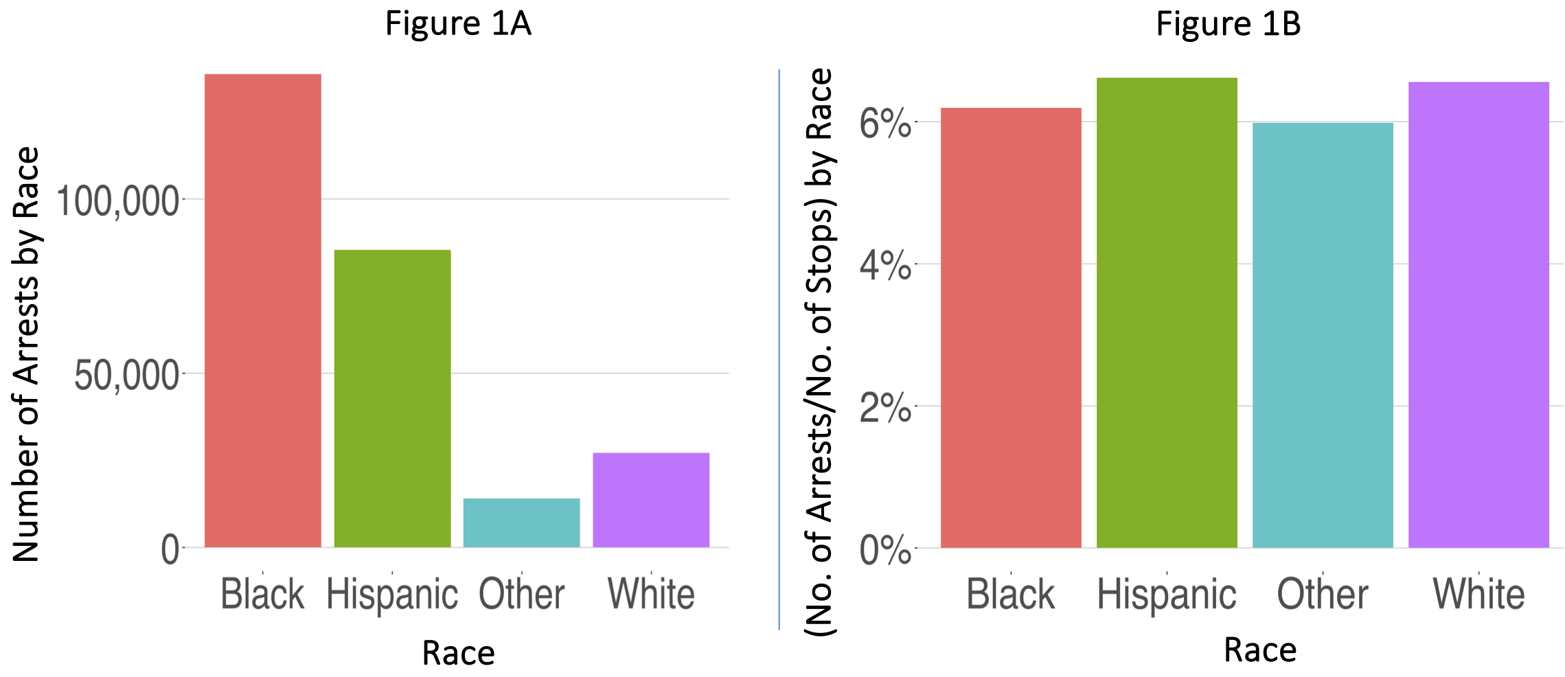
    1. Which graph should be used to better understand the possible patterns of discrimination in the NYPD, Figure 1A, 1B, or both? Briefly describe how each graph can contribute to addressing Focus Question 1. How does the story change if both graphs are used?

    2. Why is it important to consider the racial distribution of the entire city when looking at these graphs?

    3. When is it important to look at multiple graphs before drawing conclusions from a dataset?

    4. In each report, a suspect is identified by the police as male, female, or unknown. Are there any clear patterns related to the gender of the suspect? Assuming a male was stopped, is he more likely to be arrested than a female? Do these patterns hold true across races? (Hint: try faceting by race.)

    5. Which crime type tends to have the most arrests each year?

    6. Develop your own question that could be answered with the above NYPD Bar Chart app. Write a one paragraph answer to your question.

    1. Assume your audience already understands the source and context of the data.
    2. Include one or two graphs (cut and pasted from the app above).
    3. Clearly state your question, describe the variables in the graph(s), interpret your graph(s), and discuss what conclusions you are able to draw from these graphs.

    References

    Shannon, Joel, Feb 2019, Adorable animals across the nation are making Super Bowl predictions, USA Today. https://www.usatoday.com/story/news/nation/2019/02/03/animals-predict-super-bowl-outcome/2756507002/


    Continue to Part 2


    Data Stories


    NYPD
    Covid-19
    Recidivism
    Brexit

    Stats Games


    Racer
    Greenhouse
    Statistically Grounded
    Psychic

    Questions?


    If you have any questions or comments, please email us at DASIL@grinnell.edu

    Dataspace is supported by the Grinnell College Innovation Fund and was developed by Grinnell College faculty and students. Copyright © 2021. All rights reserved

    This page was last updated on  November 11th  2024.