Using Graphs to Grow the Best Crops
Contributors: Shonda Kuiper, Anna Olsen,
Ginger Rowell, DASIL, Shreyas Agrawal' 24
Figure 1: Settings to start Greenhouse Game for Part 1
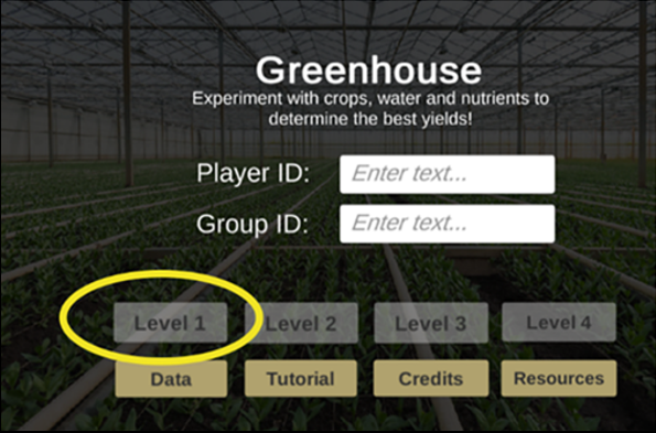
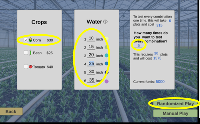
Figure 2: Settings to generate data for Part 1
Part 1F: Discussion Questions
Develop a strategy to optimize your profit when growing corn in Level 1 of the Greenhouse game. Use your
statistical knowledge and any analyses you choose to address the following steps:
1. Provide a graph and briefly explain how the graph helps you determine the amount of water that would
give you the highest profits
2. Play one season of the Greenhouse game again, implementing your strategy:
a) Provide the same Player ID
b) Add a “c” at the end of your Group ID. For example, if your Group ID was Stat101S22, now use
Stat101S22c
c) Select Level 1
d) Select only the corn crop.
e) Choose any amounts of water and any number of plots.
After playing one season, submit your Player ID, Income, Expenses, and Profits to your instructor.
Compare your profits with those of your fellow students by entering your new Group ID below. Sometimes
it can take up to 60 minutes for your class data to show in the app below.
Part 1G: Get Curious 
Evaluating a linear model: Use Settings A in Greenhouse App1
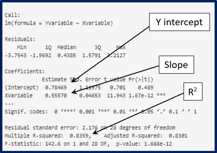
3. Based on the linear model created in App 1 to address the following questions:
a) Notice that the yields vary, even when the same amount of water is used. Explain why this should
be expected.
b) Modify the X Axis Limits. When is a linear model a good fit for this data? When
is a linear model a poor fit for this data? Briefly explain how you distinguish a good fit from a
poor fit.
c) If modifying the range of the data improves the linear model, would it be appropriate to remove
some of our data? Why or why not?
Evaluating class data: Use Settings B in the Greenhouse App1
4. Sometimes it can take up to 60 minutes for your class data to show in Greenhouse App1. After your
instructor confirms enough class data is available, answer the following questions.
a) What is the explanatory variable and response variable for this data?
b) What are the units (what does each point represent)?
c) Does it look as though all the players followed the instructions in Step 1B? Explain why or why
not.
d) Do the results from your class agree with the sample1 data? Explain why or why not.
e) Try some different statistical models. Which one looks like it best describes the data?
f) What conclusions can you draw from this data and the corresponding regression model?
5. Address the following questions about different ways we could have conducted this study to improve
the quality of our data:
a) Are there better variables to use? For example, what would be the benefits to using
Profit or Revenue as the response variable instead of Yield?
b) What are the benefits to randomizing the amount of water assigned to each plot?
c) How many plots would need to be tested to convince you that there is a relationship between
Water and Yield?
6. In order to create a meaningful regression model, we should take into account possible
confounding variables [variables that the researcher did not include in the study but
that might be connected to both the explanatory (independent) variable and the response (dependent)
variable]. List at least two potential confounding variables that might get in the way of determining
the relationship between Water and Yield.
7. Go back to the Greenhouse App1, use Group ID = sample1 and Y Variable =
Profit, then create a linear model.
a) Explain why the linear model does not work as well for profit as it did for yield.
b) Based on this graph, what amount(s) of water should be used to get the most yield?
c) Create a graph and write a paragraph clearly explaining to a farmer the best strategy to maximize
corn profits in one season.
8. Experiment with making your own graphs in R with this LearnR GreenHouse Tutorial.